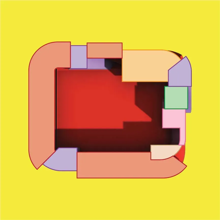
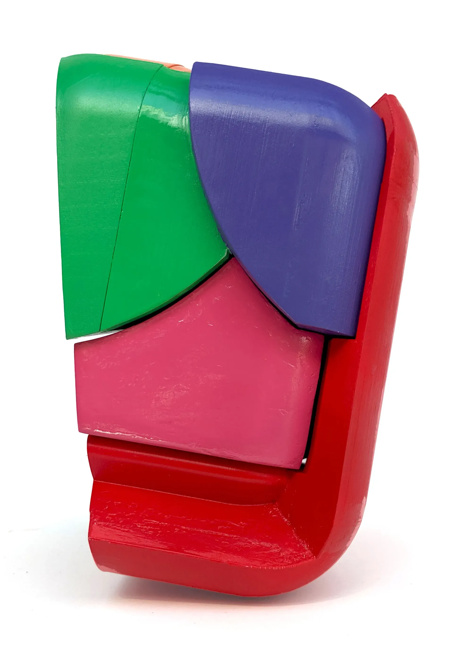
Thing in a Thing in a Thing
A Toy
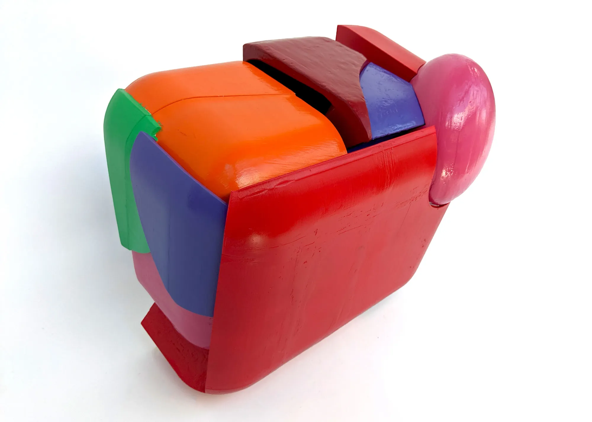
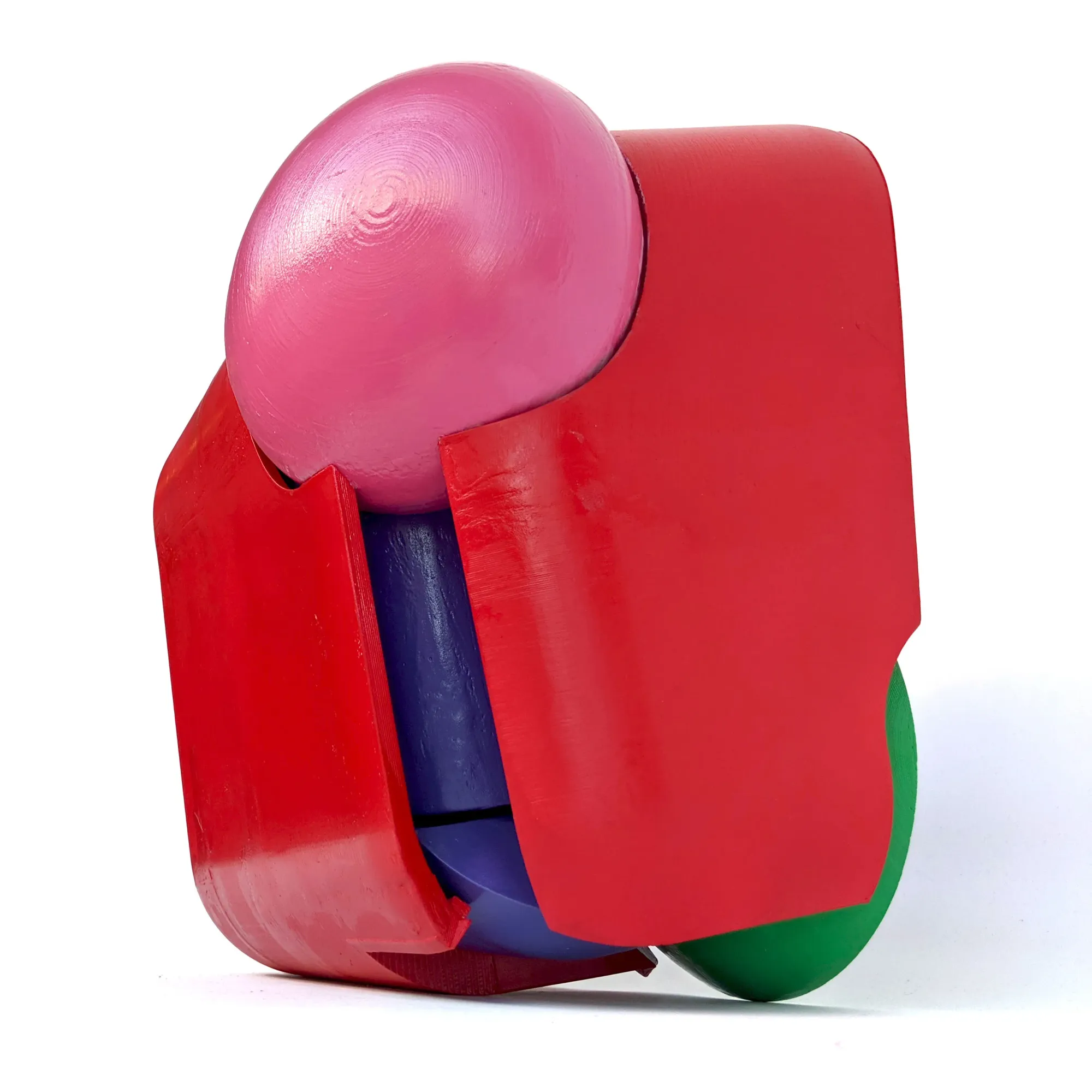
This toy is an investigation into how inherent properties might be used as variables in developing a formal strategy that is (in this case) reliant on color, rather than that same color being haphazardly applied after a toy has already been made.
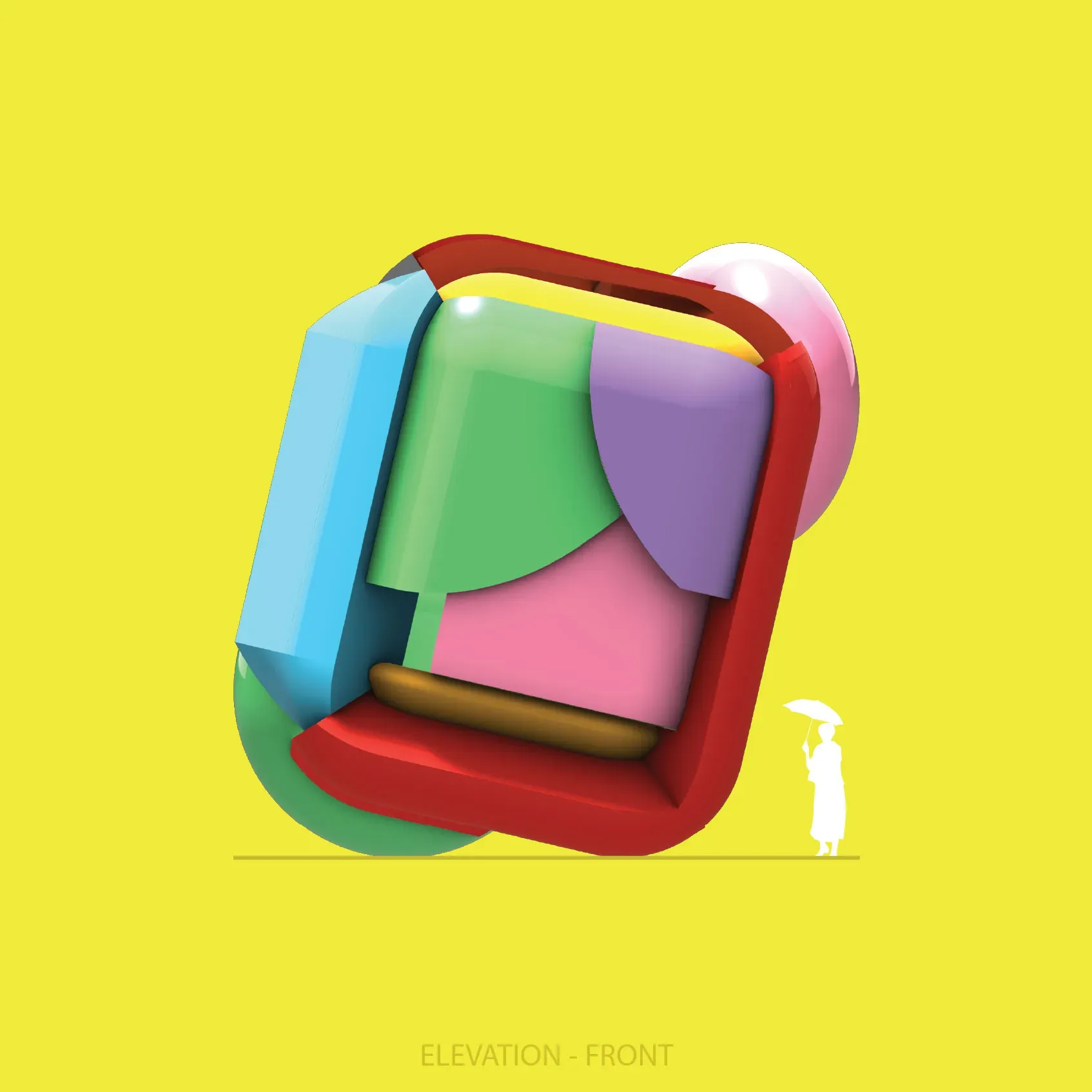
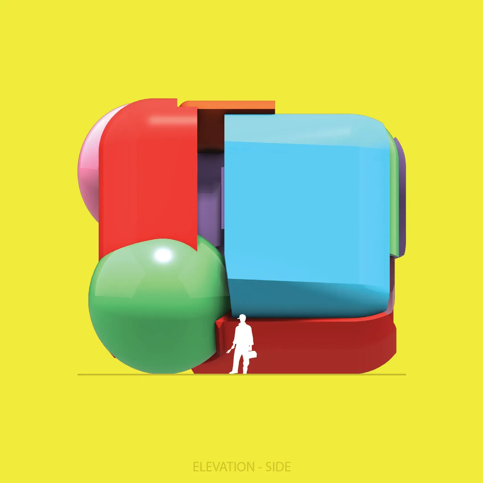
A colorful primitive undergoes a mutation that displaces its surface based on the value of its colors.
This form cannot exist without its color.
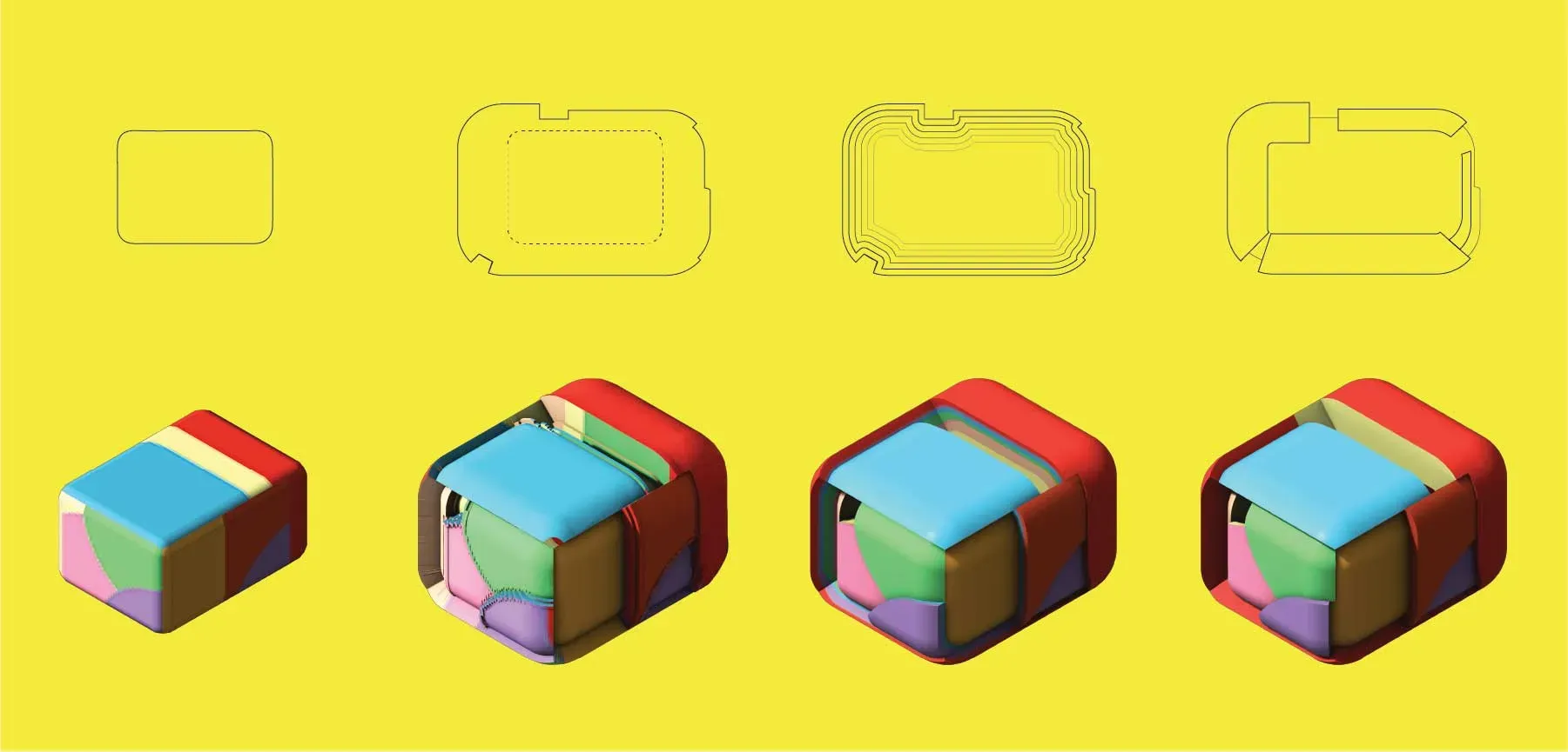
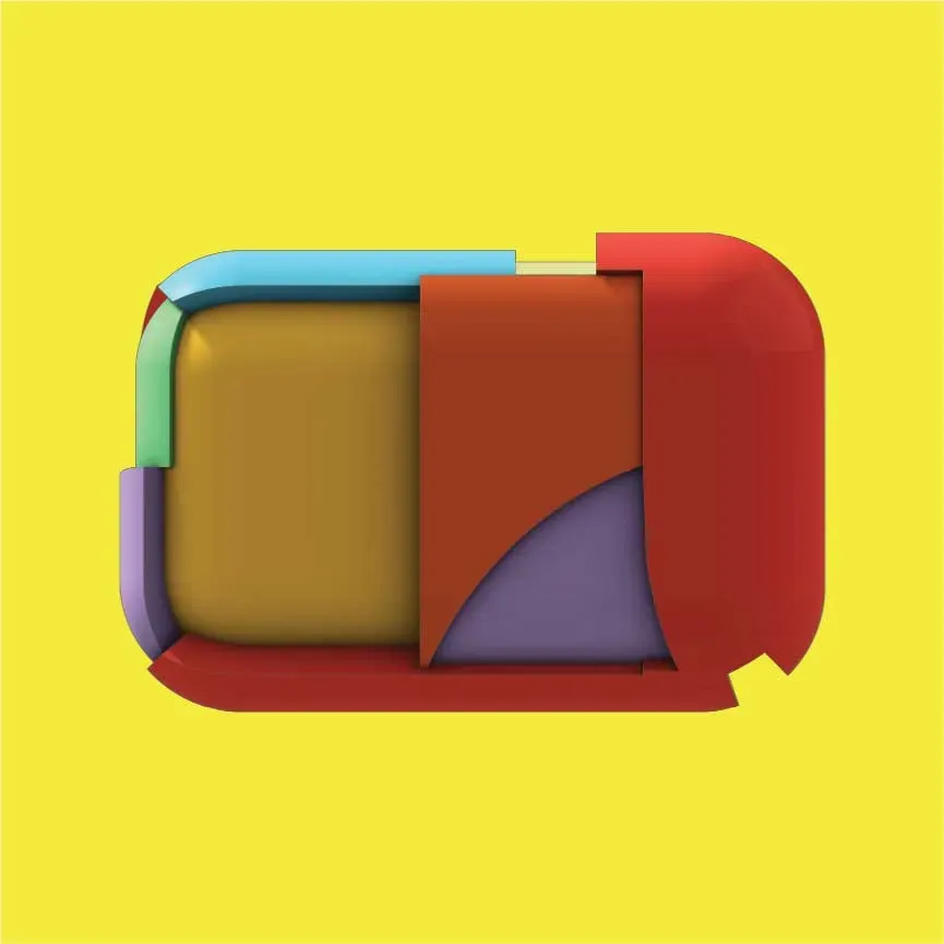
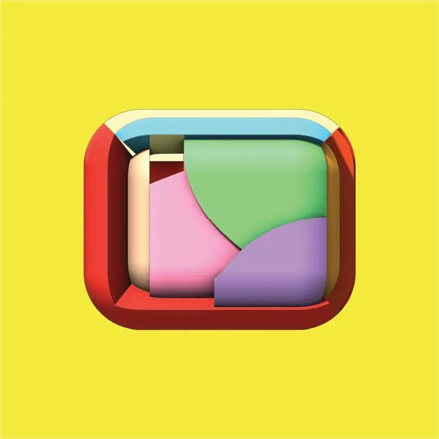
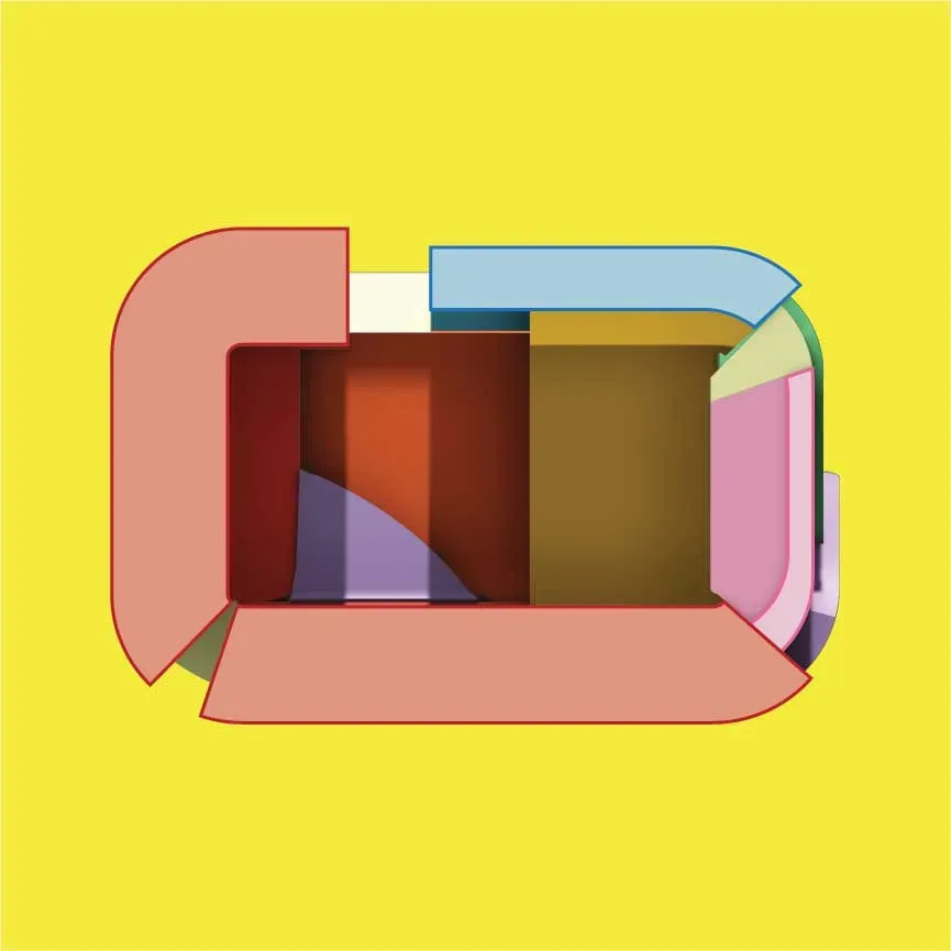
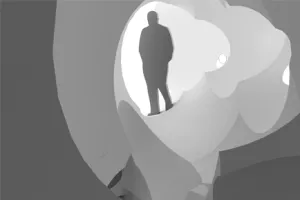
A Pavilion
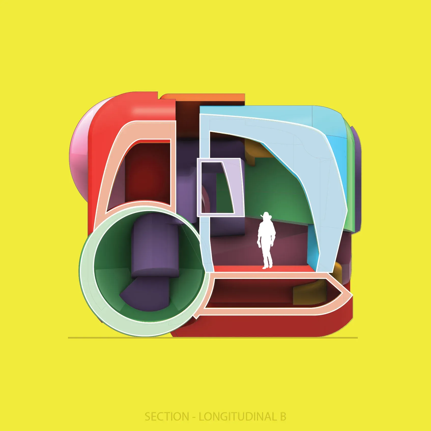
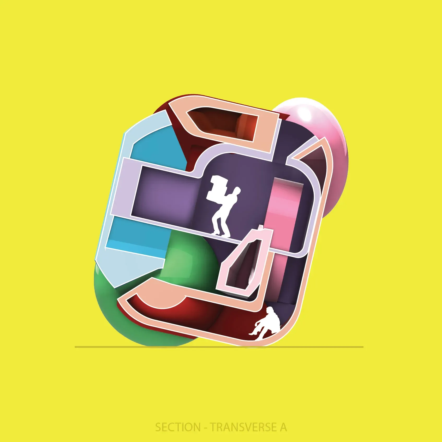
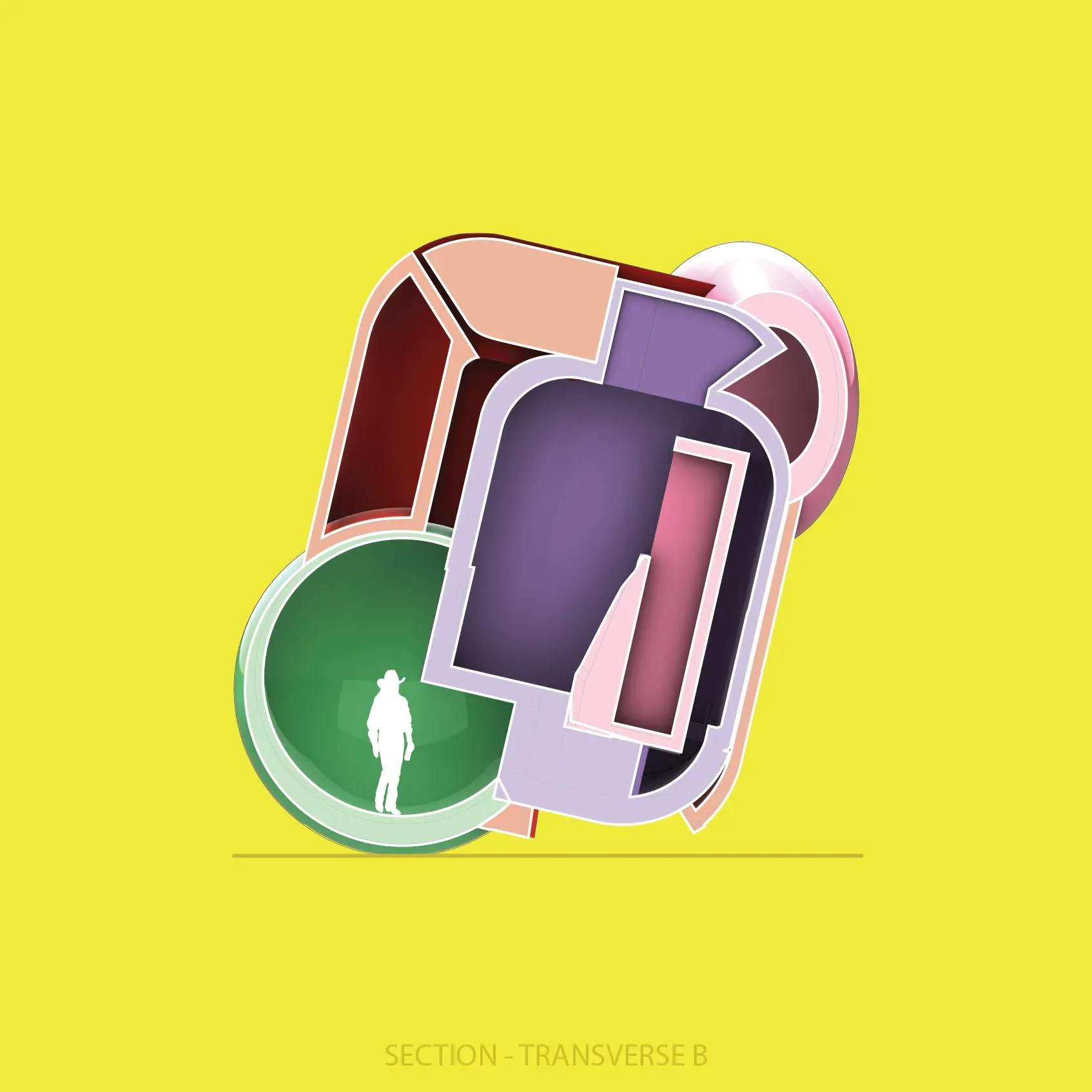
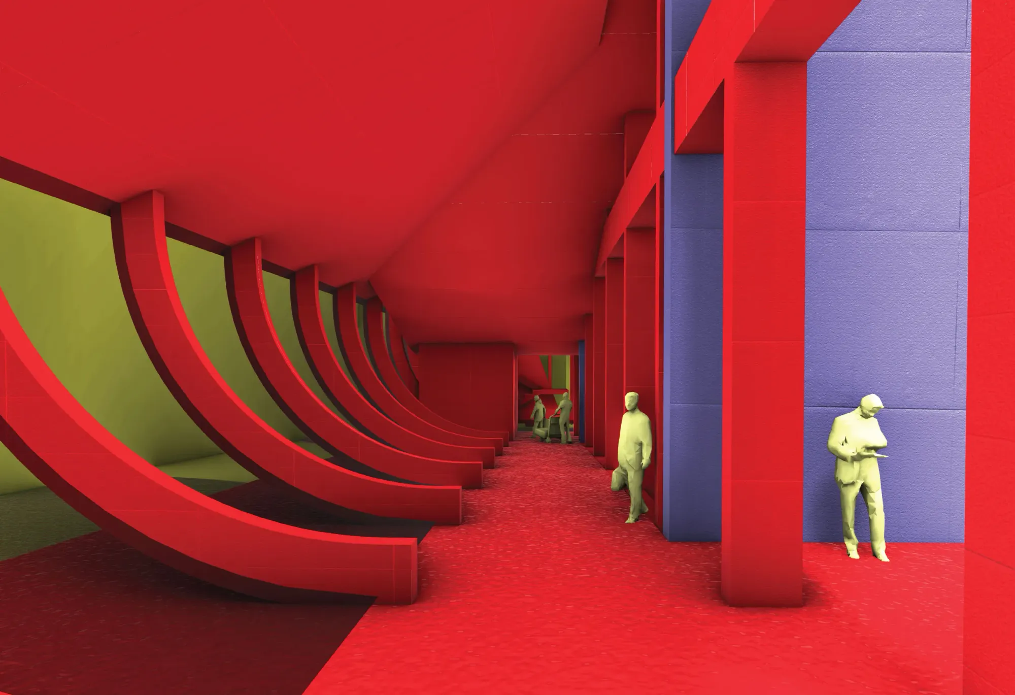
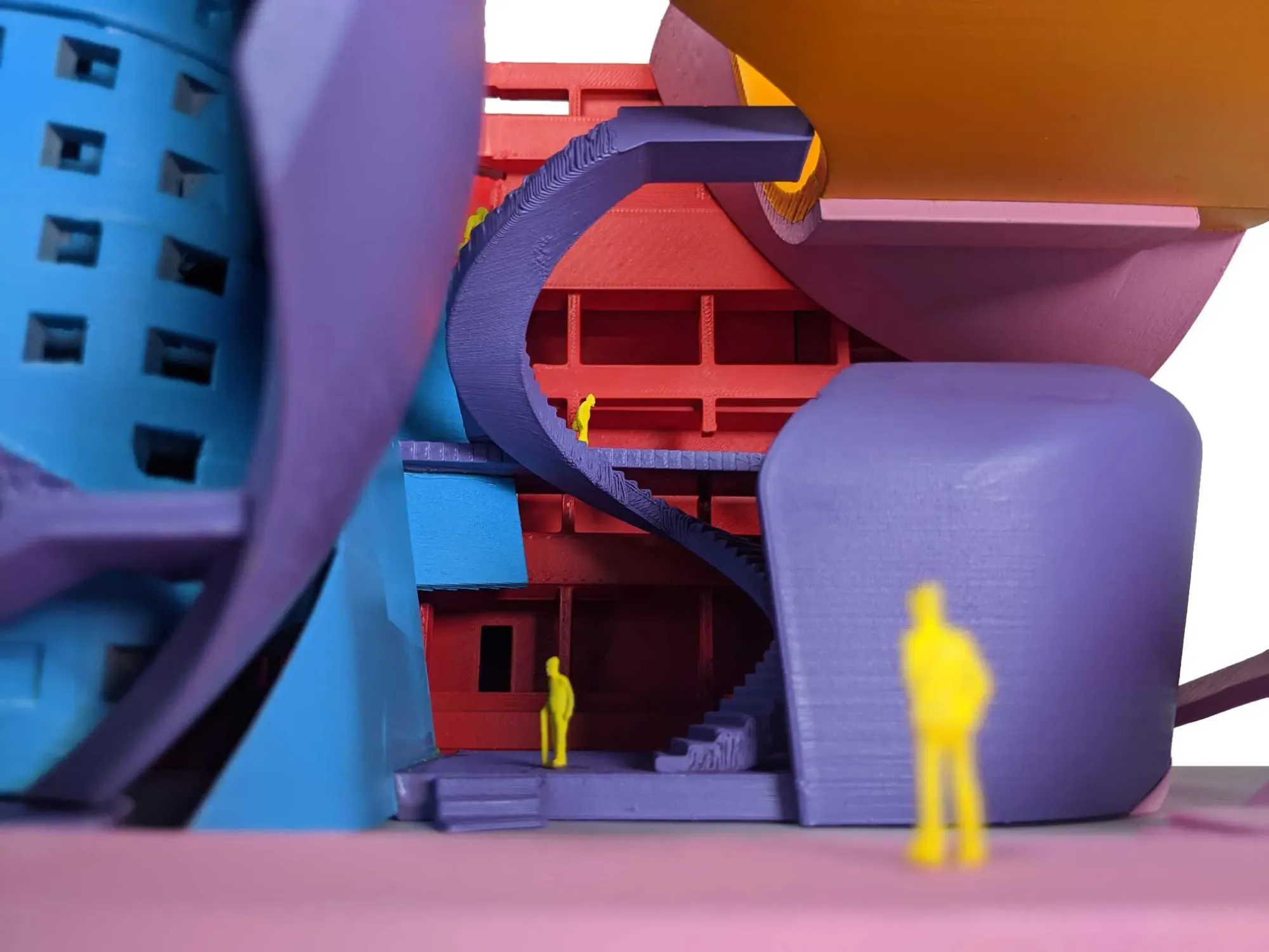
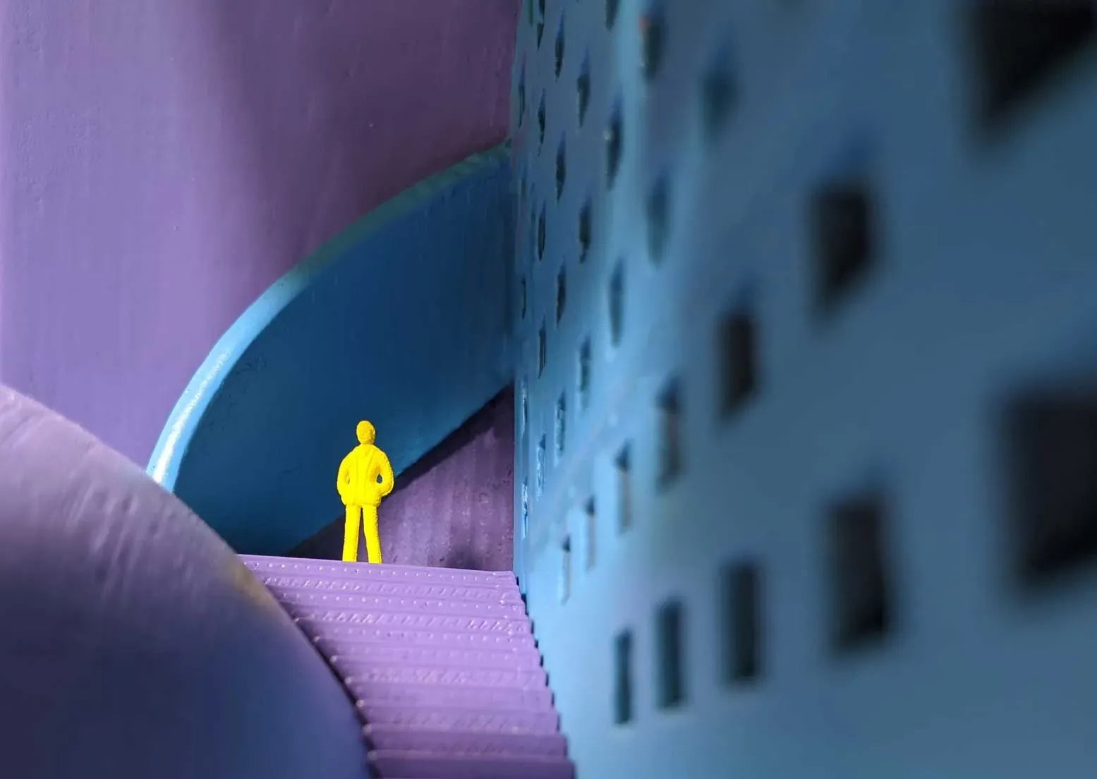
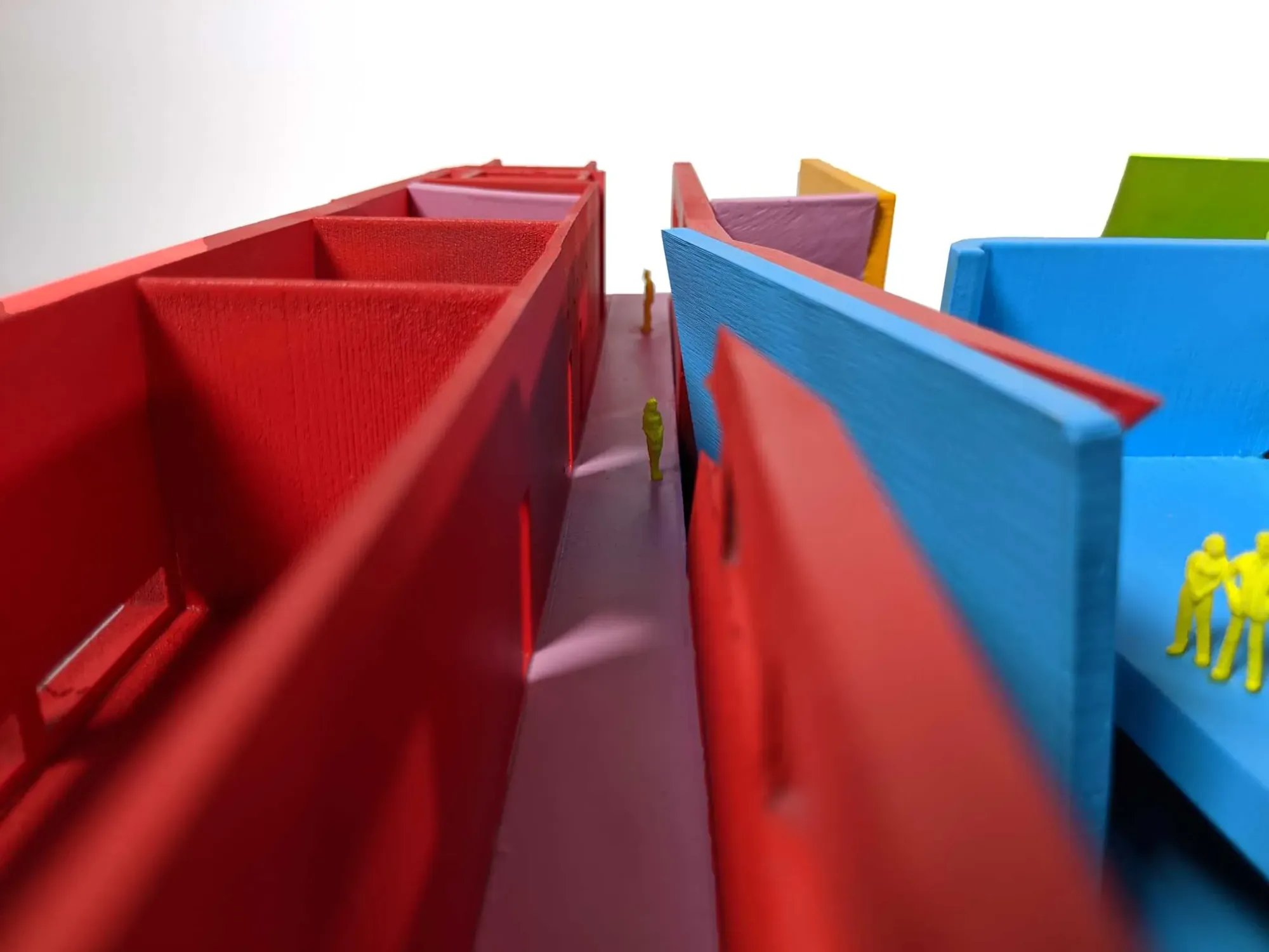
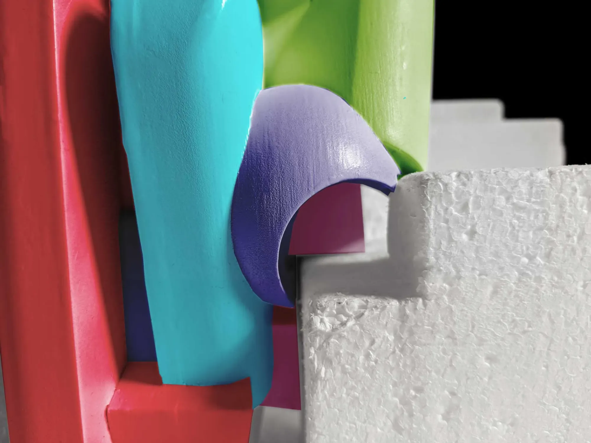
The toy grows into a pavilion...The blocks of color around the perimeter expand inward, overlapping and intersecting with each other. The more visually submissive colors from outside (purple, pink, green) take precedence on the inside, subverting expectations between the interior and exterior experience.
As the interior filled with color, it is forced out of the original toy’s openings, disrupting the way in which the container sits on the ground.
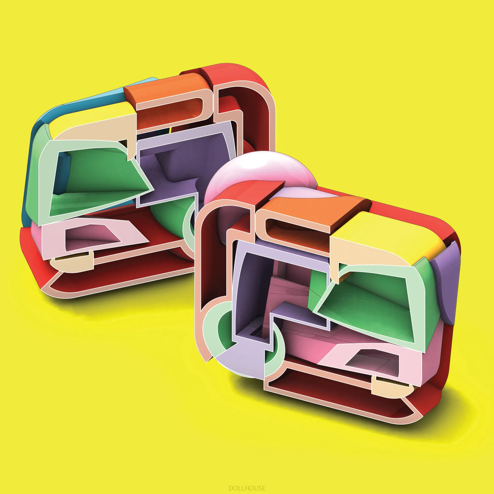

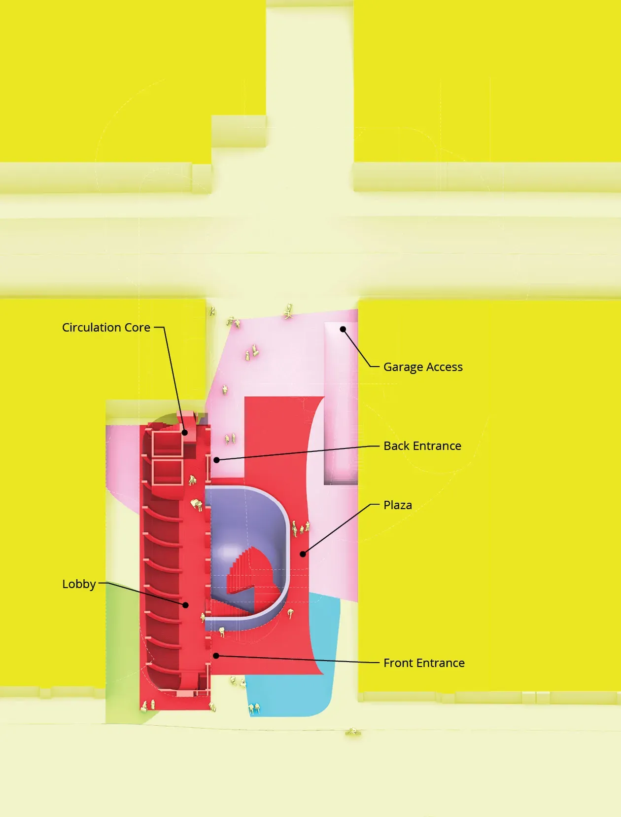
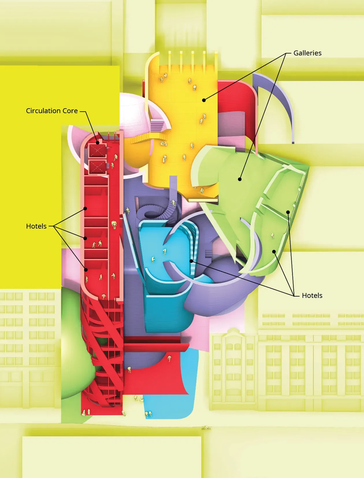
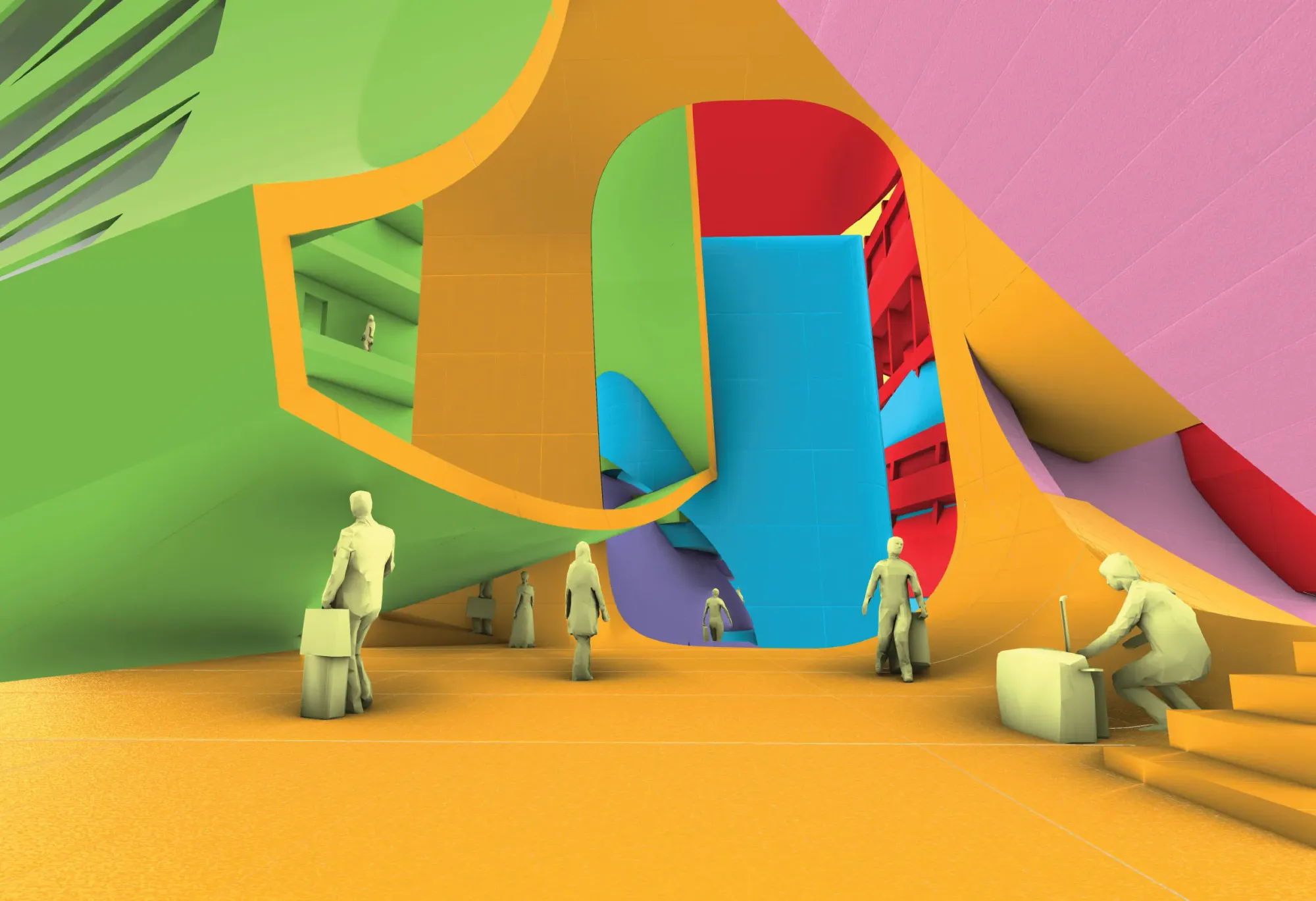
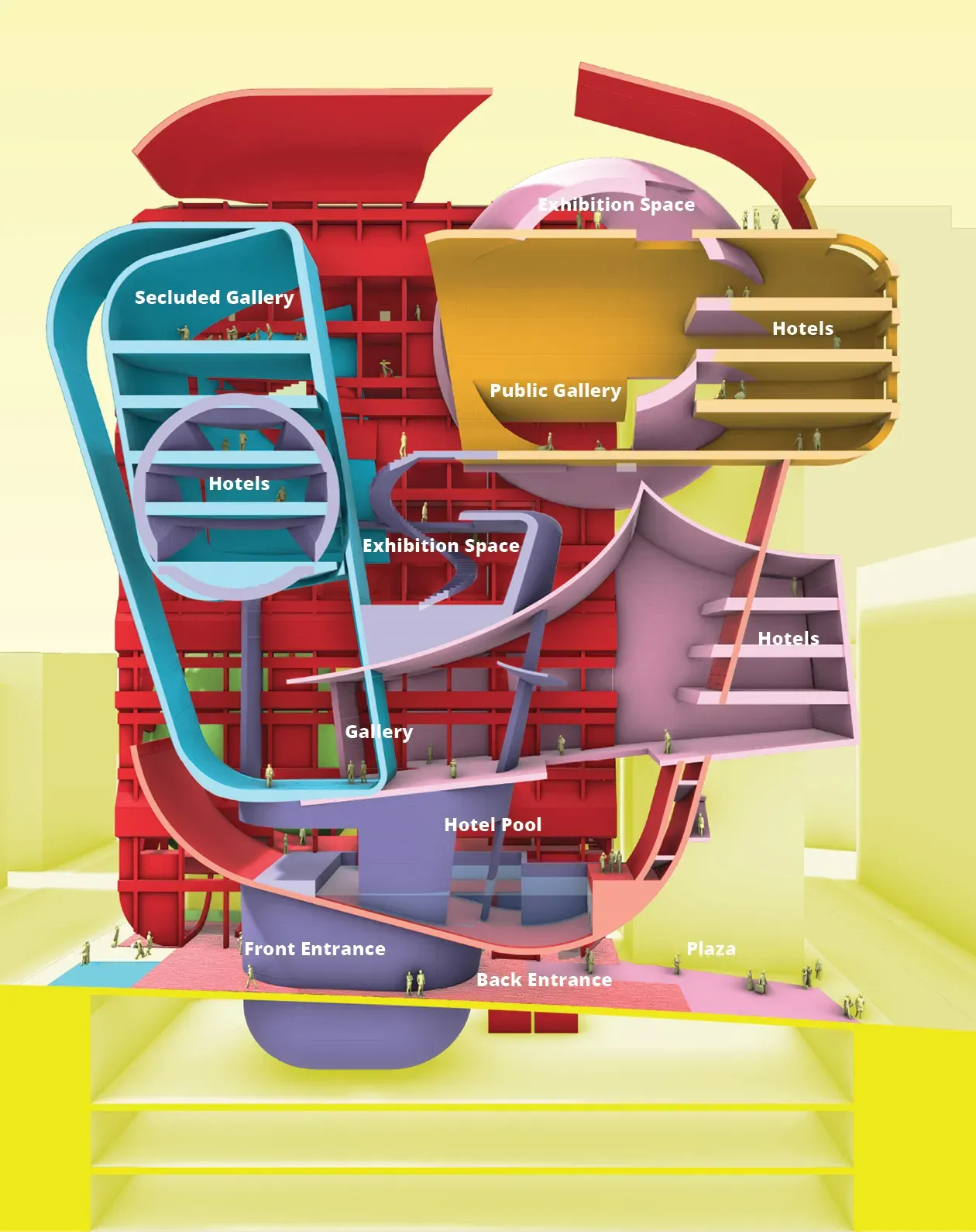
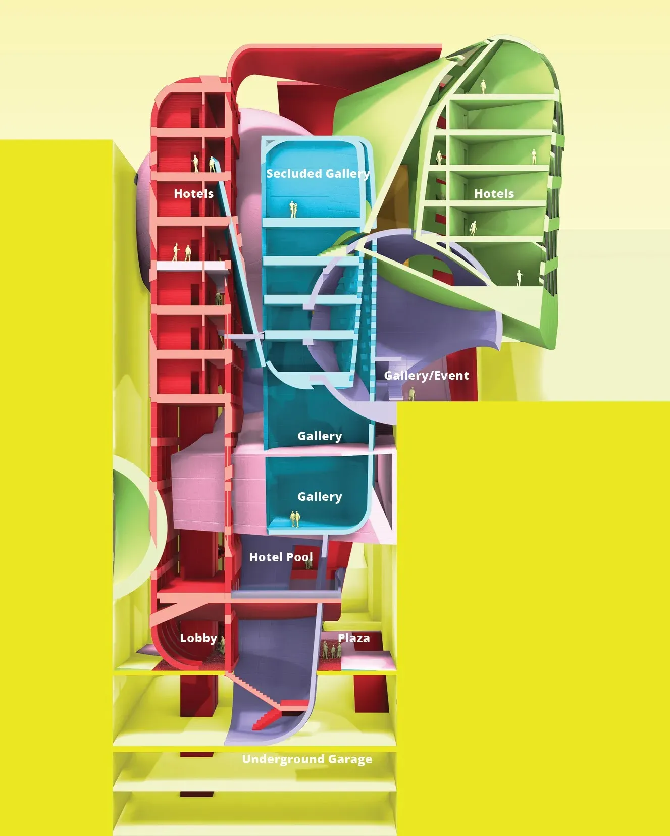
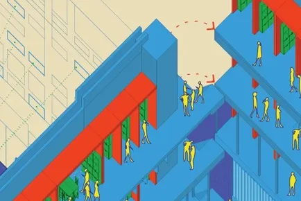
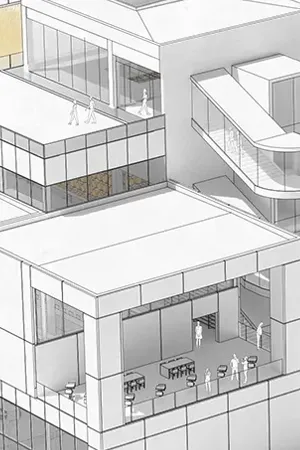
A Boutique Hotel & Public Art Gallery
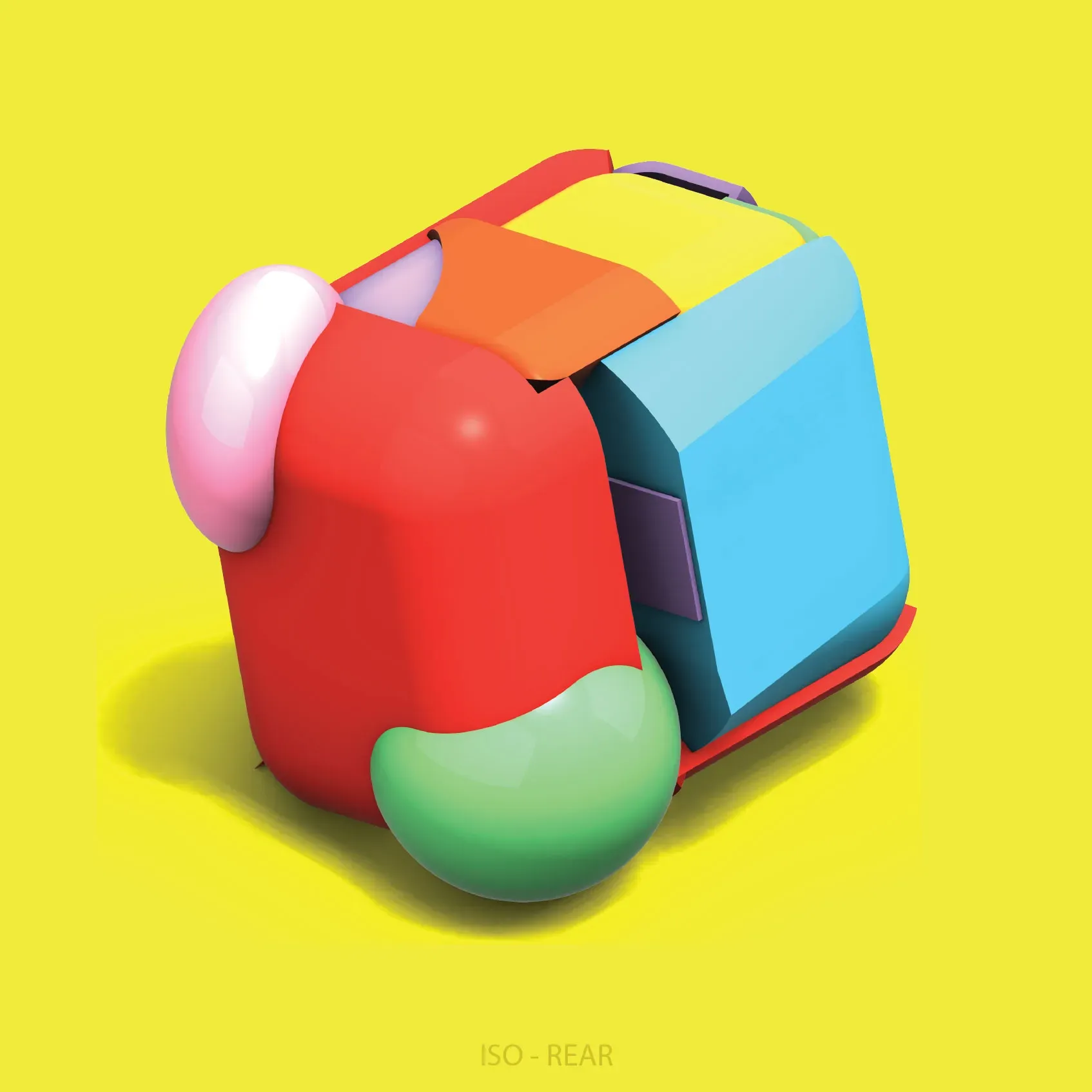
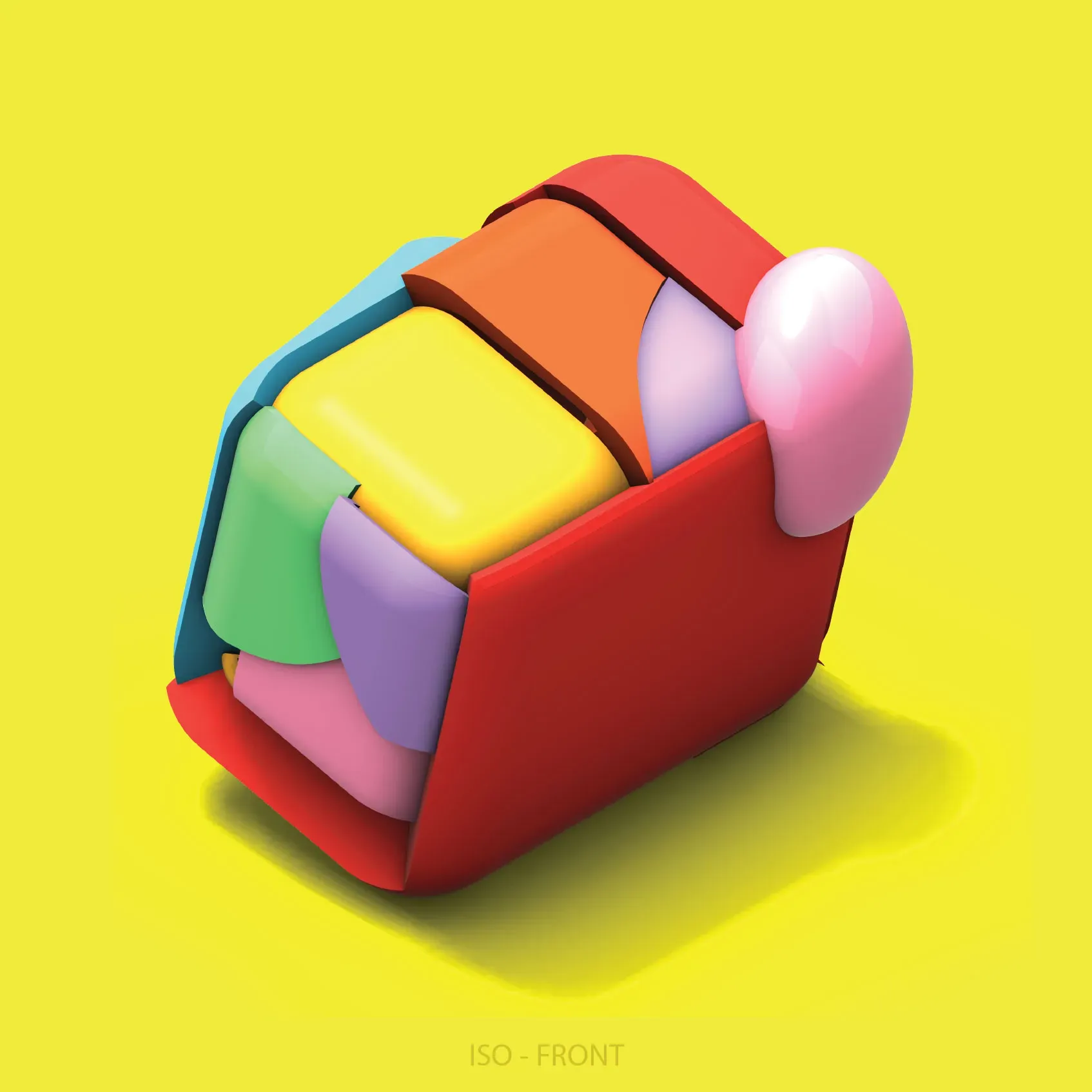
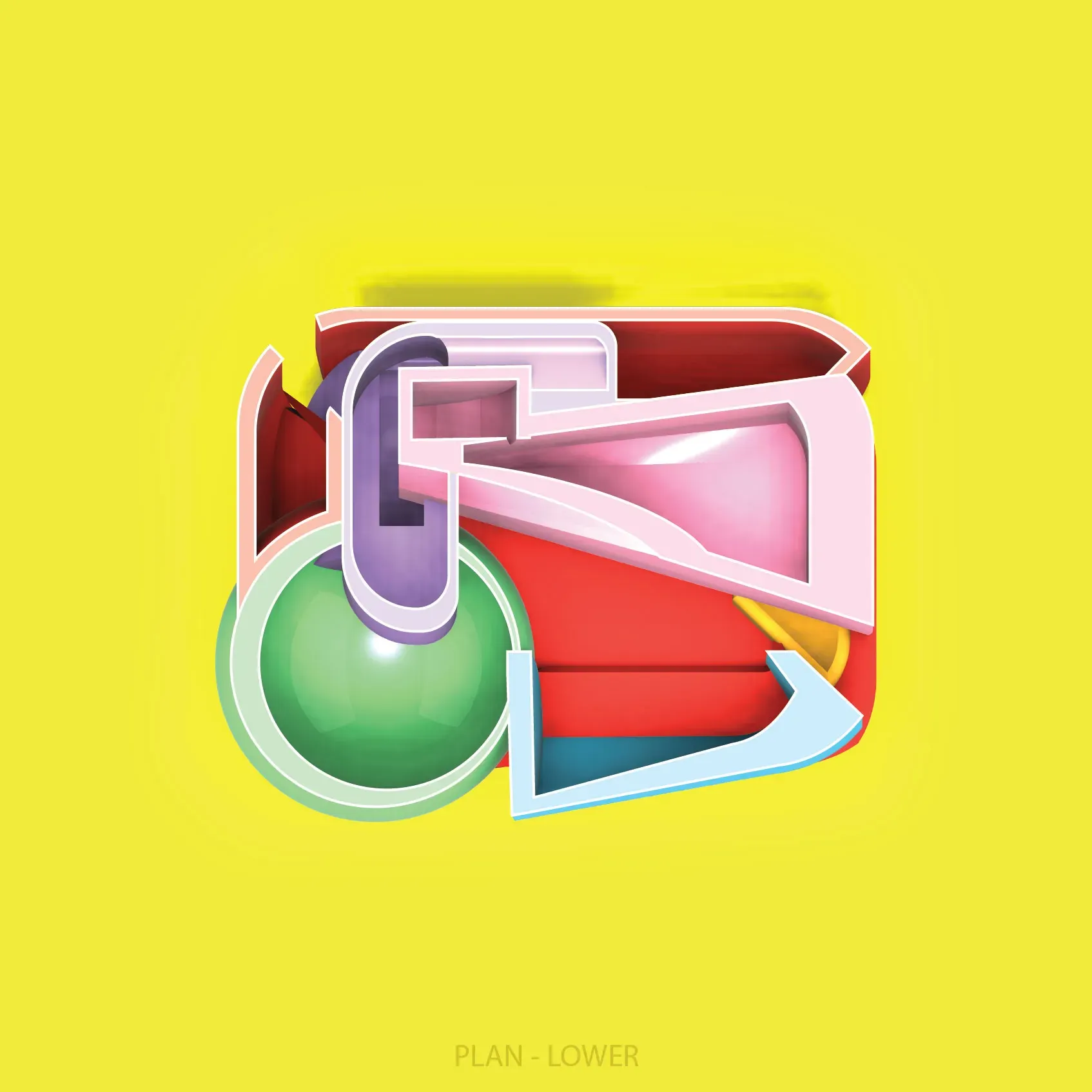
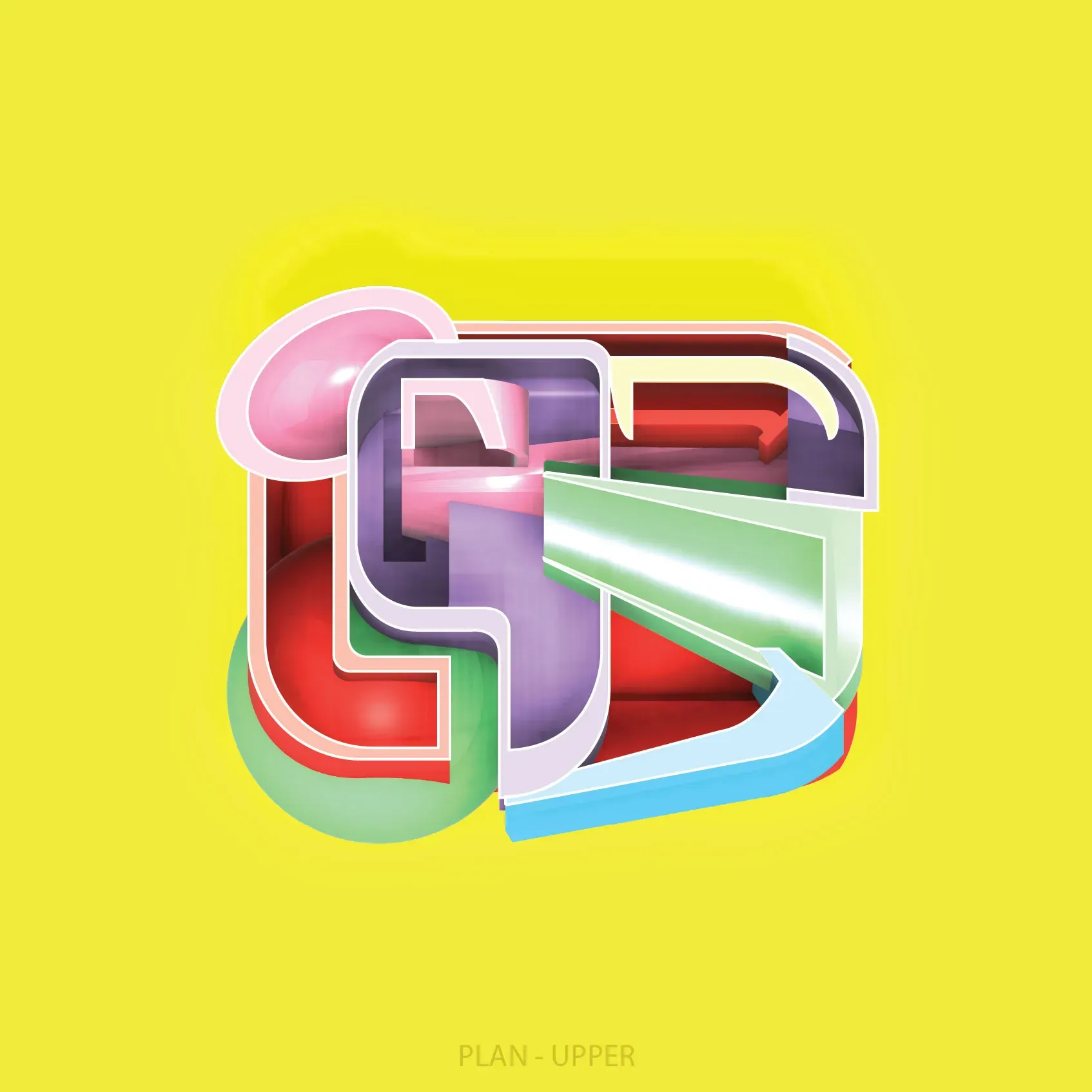
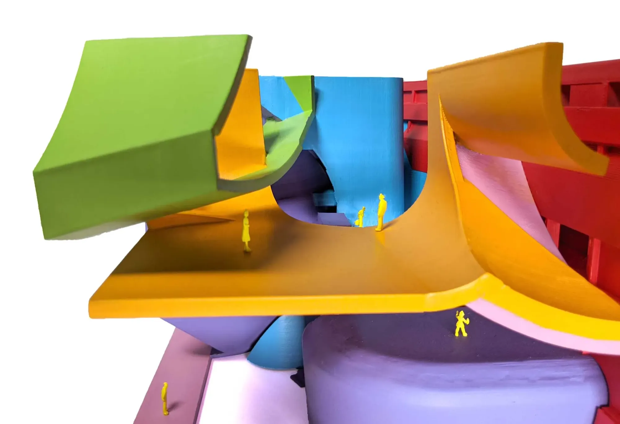
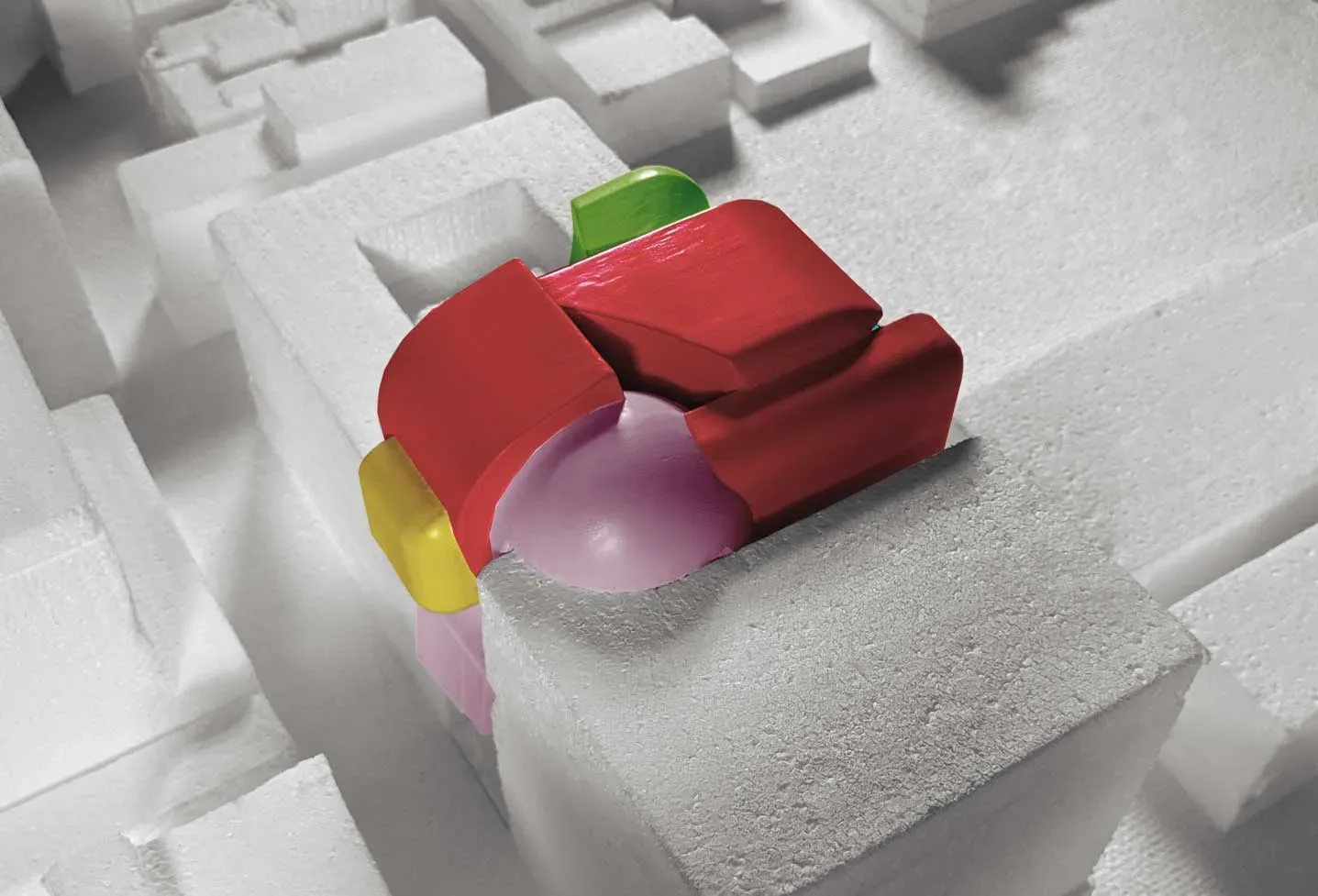
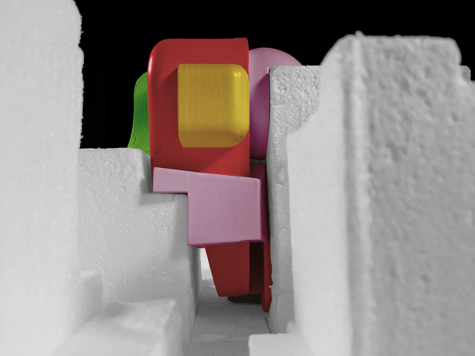
On the exterior, you see a cornucopia of colorful masses in a loose-pile. One assumption might be that each color and volume is representative of a different room and function. Moving inside, however, reveals that this isn’t the case.
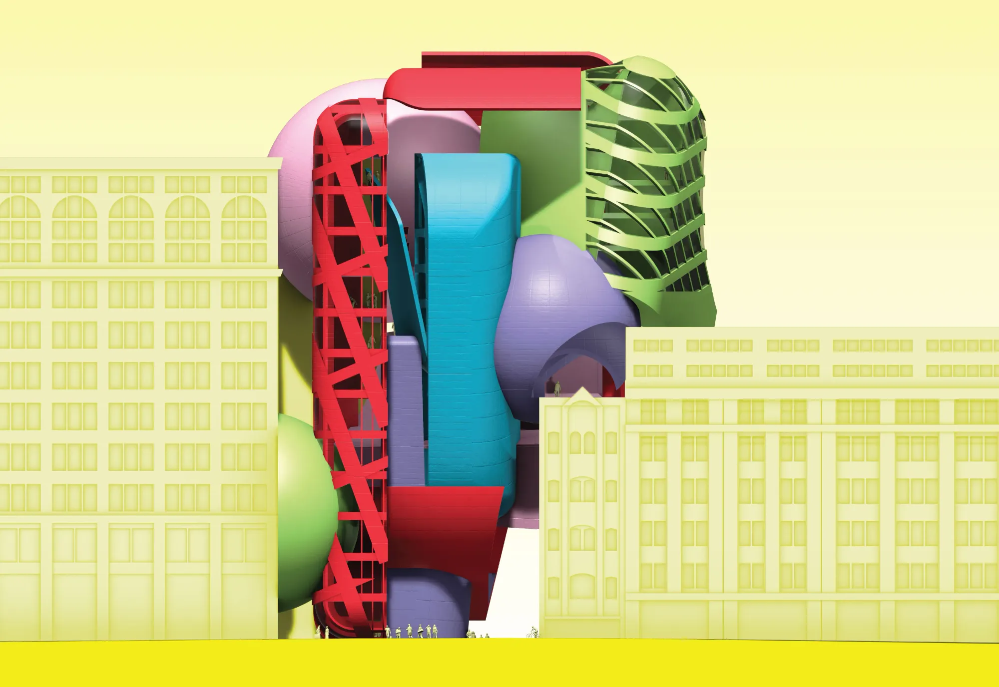
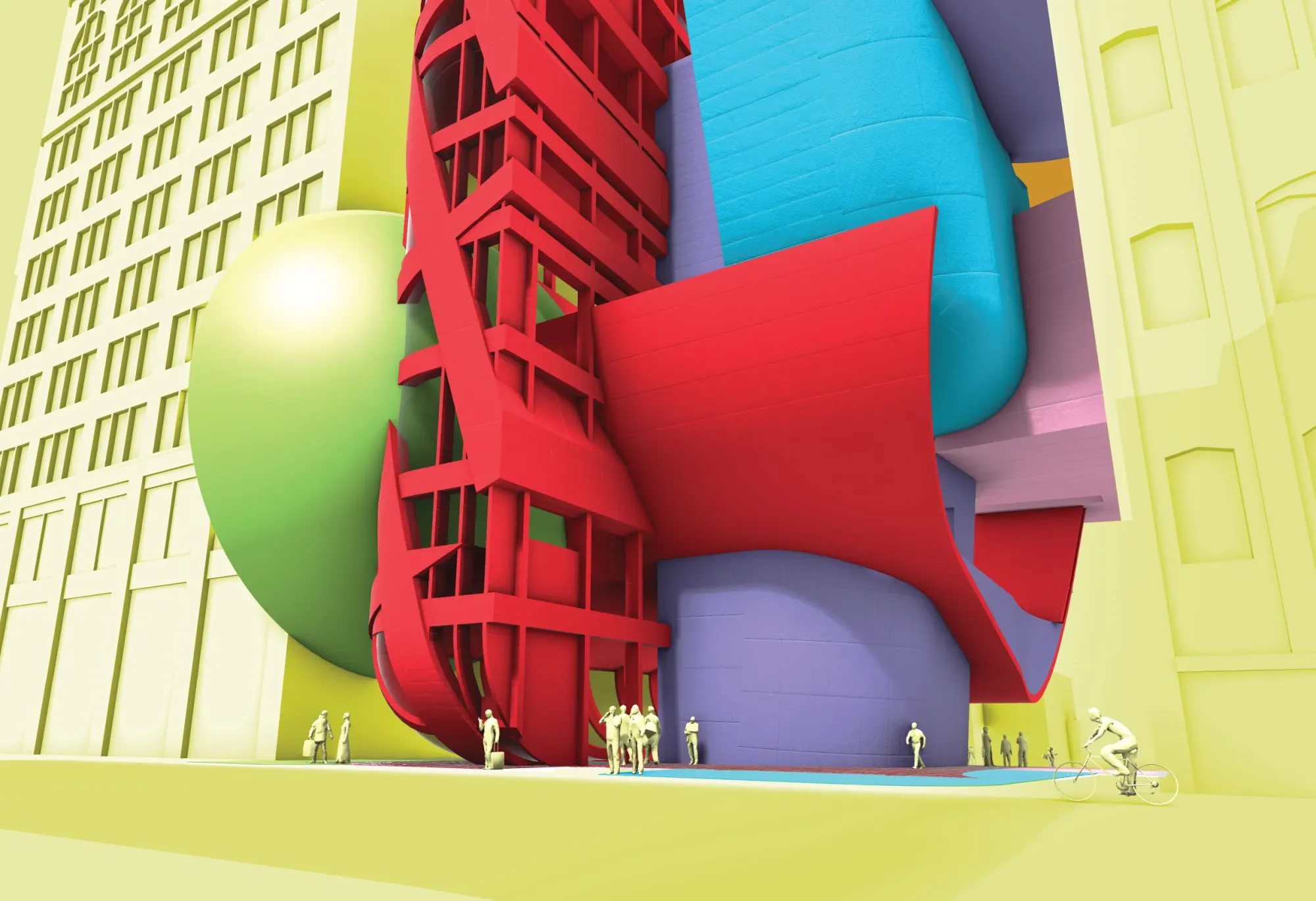
Digital Materiality
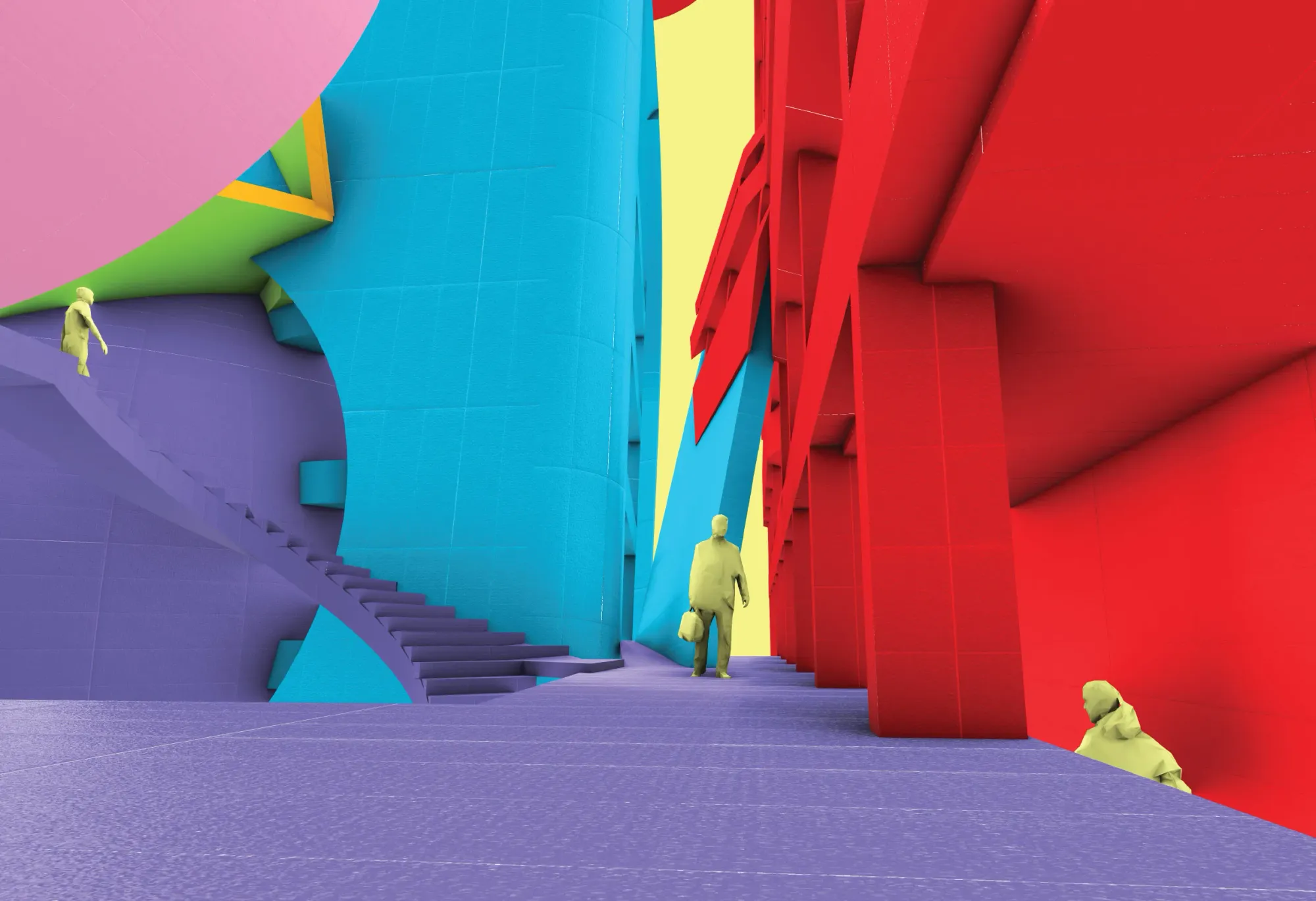
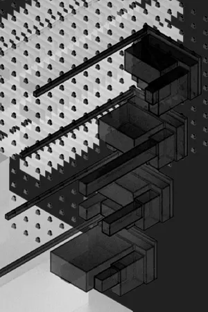
Formally, this project is a loose-pile of volumes originally subjected to digital rules from its designed environment that are merging with reality. Through the intersections of volumes, as well as the interstitial space between them, the color of the volumes breaks that indexical stereotype.
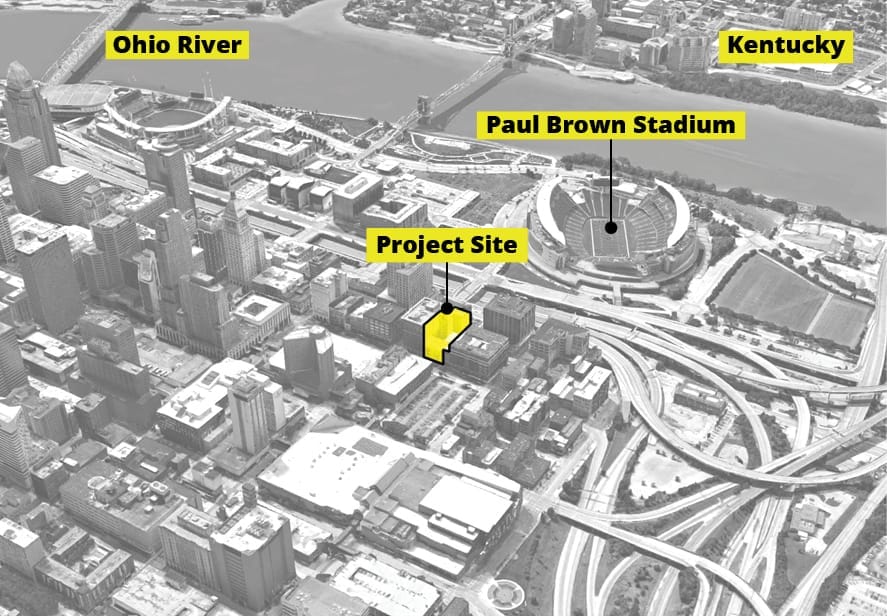
The project minimizes its footprint in favor of expanding the existing alley connecting 4th and McFarland Street into a plaza that better engages the public. The ground of the site is colored to match the pieces of the loose pile above, an open invitation to the plaza.
Agnostic Color
Why? Other artistic mediums like movies and paintings have an established color theory. Architecture does not. Some aspects of 2-dimensional color theory carry over, like the effectiveness of using complimentary colors in order to maximize visual contrast. Some do not, like many of the effects identified in Josef Albers's Interaction of Color (examples here).
Here is a brief summary generalizing the last century of architecture's attitude toward color:
Modernism ignores and belittles the use of color, it distracts from formal expression. White is pure. The only notable attempt at architectural color theory in this time being Le Corbusier.
Post-Modernism brings in vibrant colors for the sake of using color. Generally, the use of color doesn't go far beyond shouting, "WE ARE NOT MODERNISM."
Today, a lot of professional practices use color in the most mundane fashion imaginable: diagrammatically and pseudo-psychologically. All of the offices are blue because blue is calming and relaxing. The gymnasium is red because it is energetic.Every color means something. It is a means of demarcation. It is squeezing colore (color, expressive) into becoming more disegno (line, rigid), where architects thrive. It feels about as creatively satisfying as an adult coloring book, which is to say deeply depressing.
Also today you see a resurgence of color appearing in architecture more abstractly. See the work coming from schools like Ohio State, Sci-Arc, or Michigan. The color is not prescribed, it is the result of a process or a reaction to form. There is an underlying logic tying the architecture to the color, but the color itself is still freely expressed. It is awesome.
It is agnostic color.
Regarding my project, I won't say that it is some pure manifestation of agnostic color - there are many projects coming out of the aforementioned schools and a handful of theoretical practices that are working with similar ideas to a more beautiful end. The idea of agnostic color is just a way I've tried to make sense of everything I've seen and read in the last few years, and it is something I only came up with when this project of mine was near-completion.
Color in this project is never exclusively committed to a function. A hotel room can be red, but not all red spaces are hotel rooms, and not all red spaces are just red.
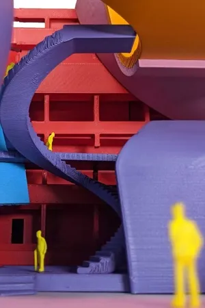
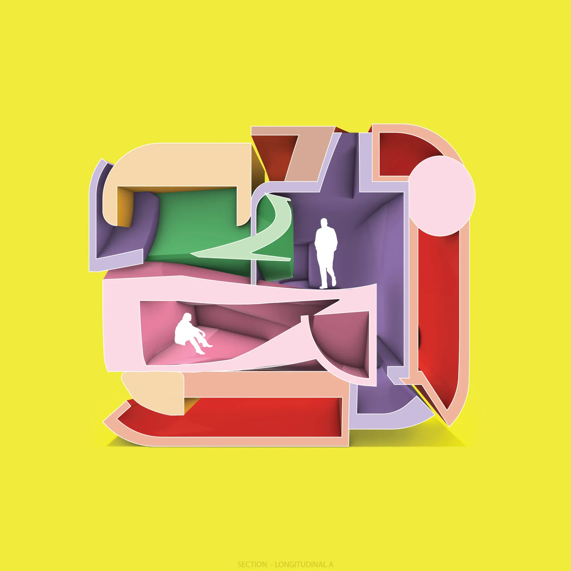
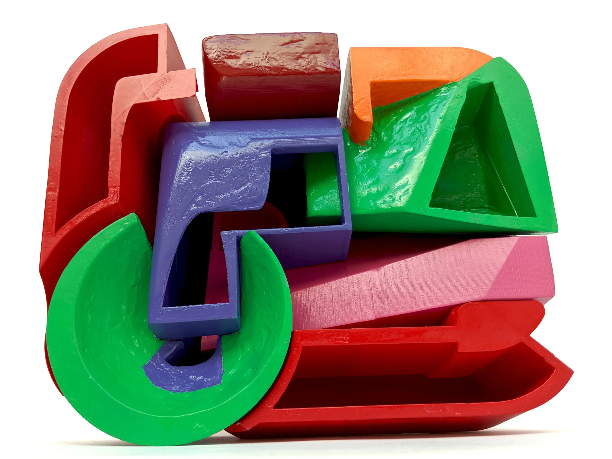
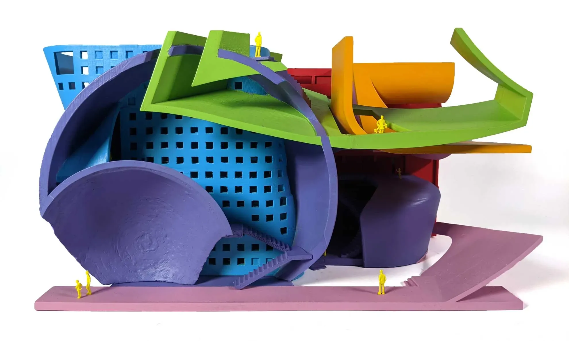
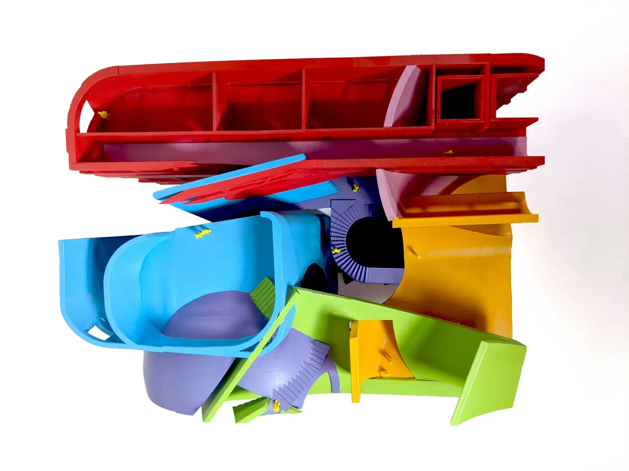
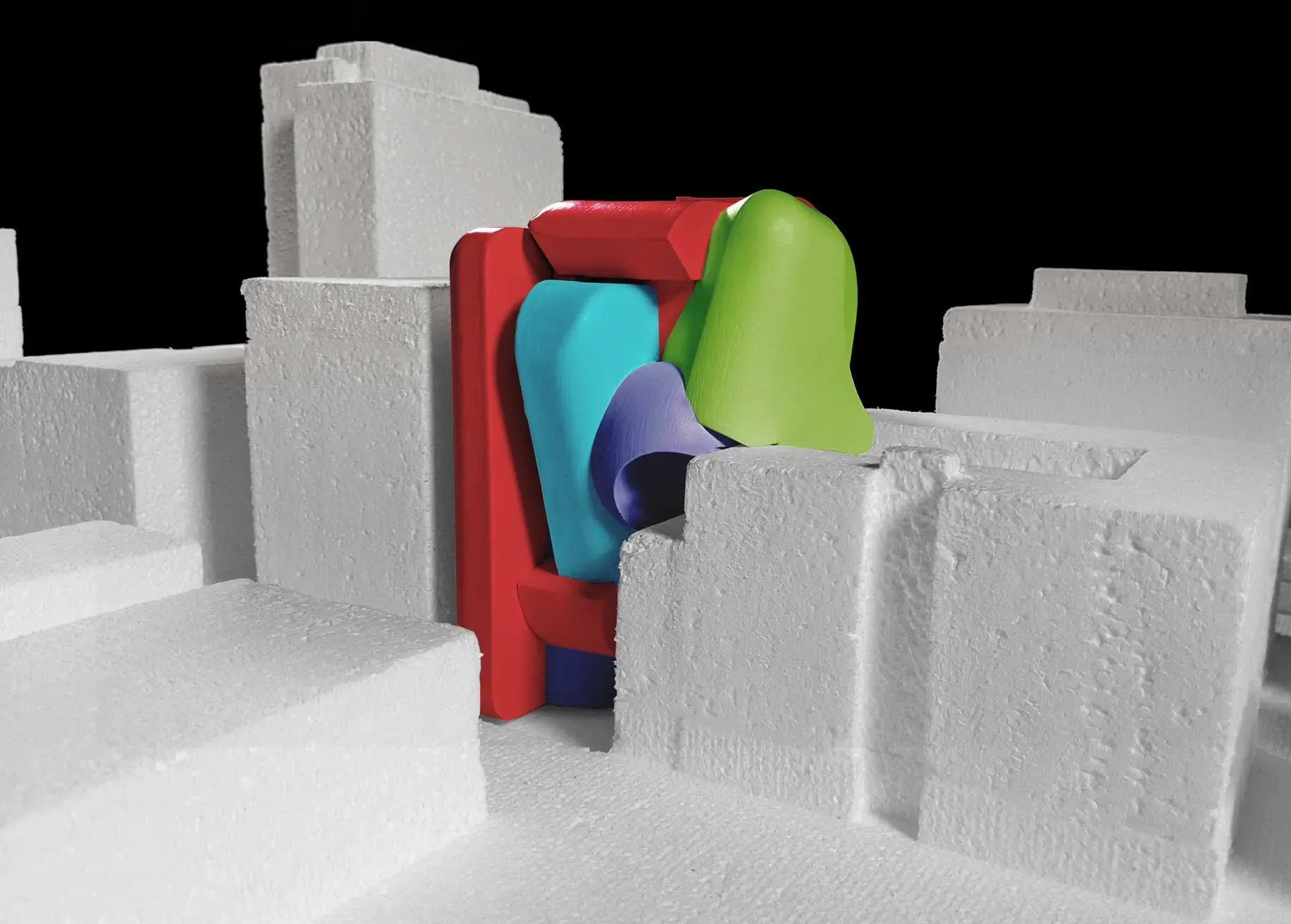
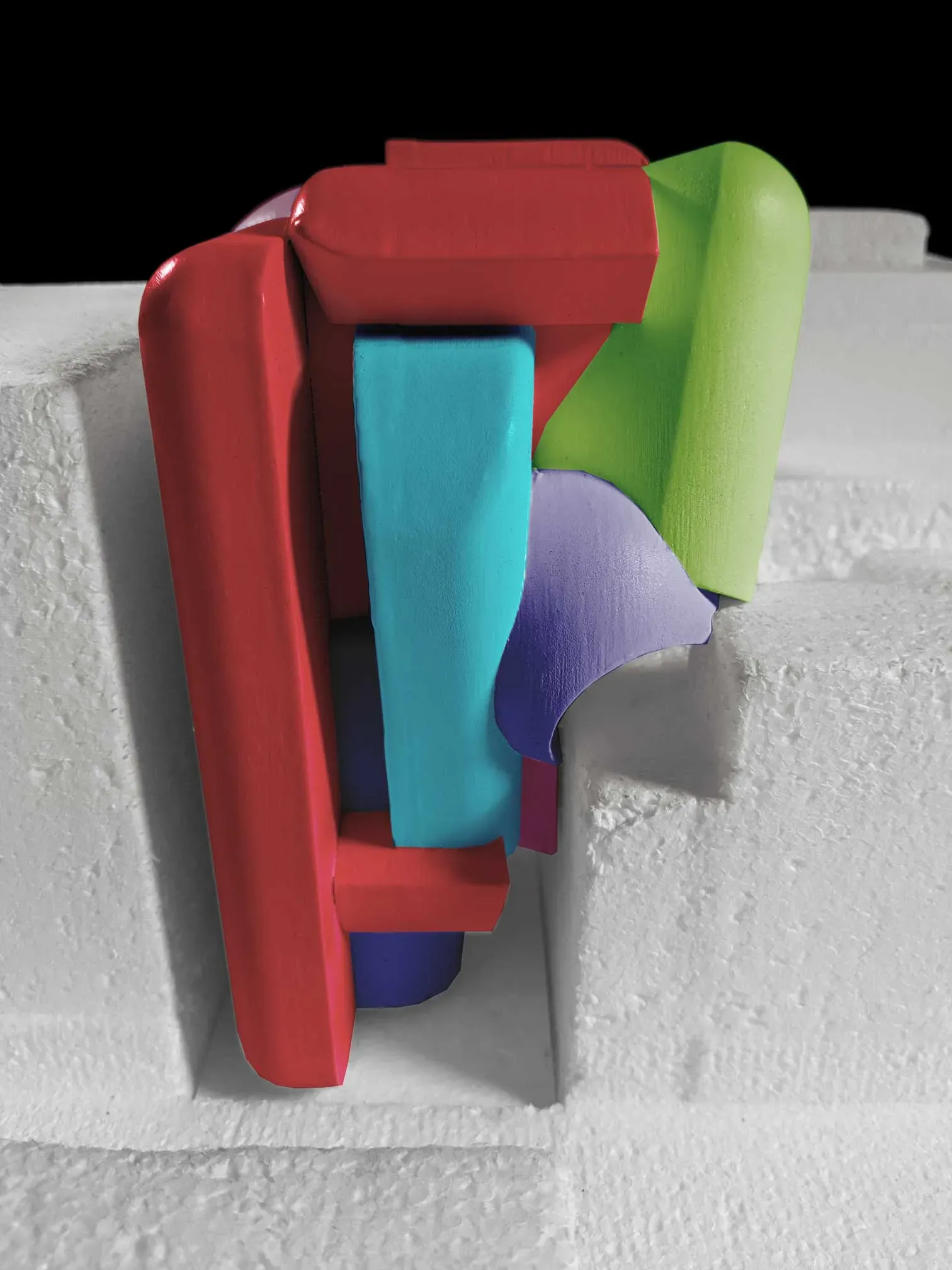
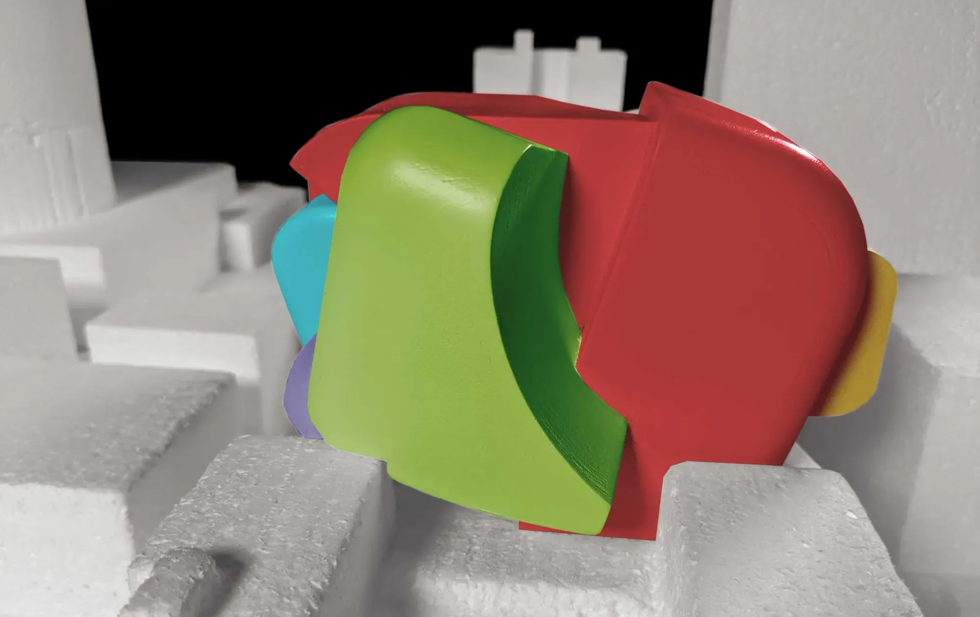
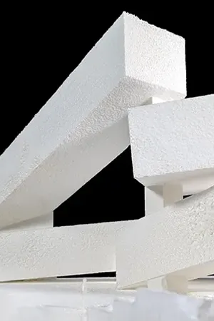
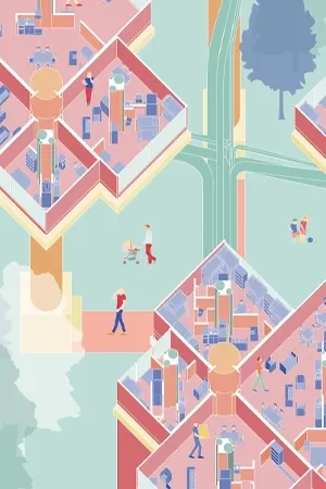
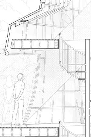
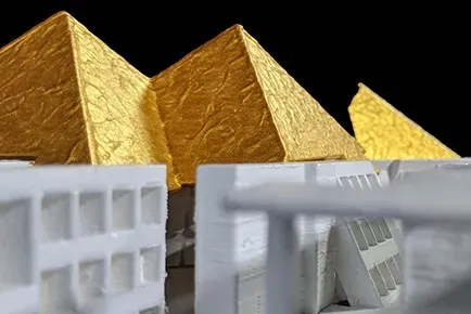
"Chunk" Model
1/4” = 1’-0”
This model is a portion of the overall building that captures the heart of the project. It shows both a number of intersections as well as how the volumes inform a dynamic interstitial space.
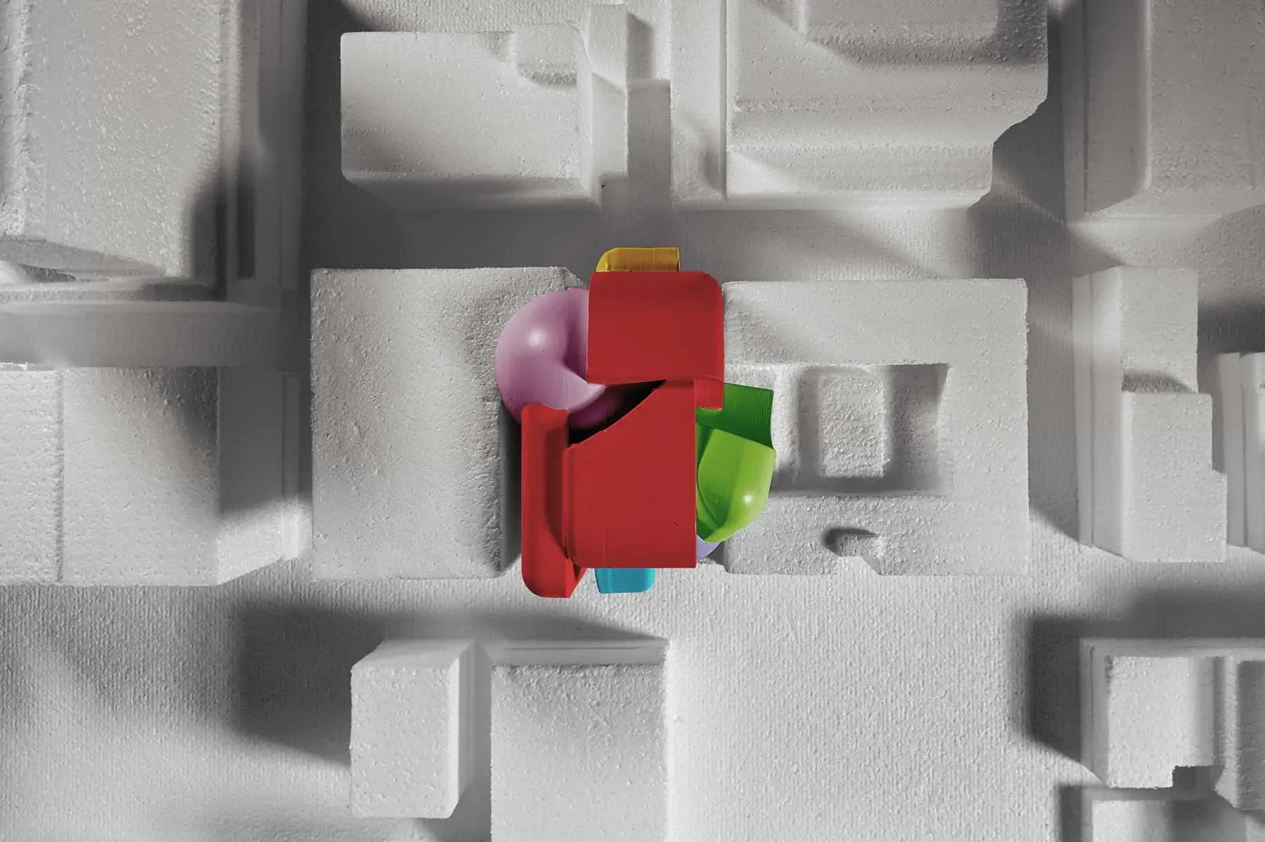
Site Model
1/32" = 1'-0"
Inspiration
Art
Bouquet - Mohammed Ahmed Ibrahim
Architecture
Soft Brick - Christopher Campbell
Studio was led by Erik Herrmann of Outpost Office and Sandhya Kochar.
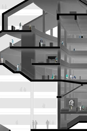


![[Conserv/Labor]-atory](/content/images/size/w300/2024/03/interior-high.jpg)


